

CambriaUSA.com Design System

As Cambria’s Digital Designer, a big portion of my role focuses on building and maintaining a robust design system that serves as a comprehensive set of guidelines, components and tools that ensure consistency and efficiency in our digital products. This ever-evolving system contains the standards for website elements such as typography, color palettes, and UI components as well as annotations for enhancements to new experiences that our in-house dev team works to implement in partnership with creative.

A comparison of button styles in different states: default, hover, pressed, disabled. Buttons are labeled 'Explore more' in various colors and styles.

This project is currently under construction.

Full overview coming soon!

This project is currently under construction. • Full overview coming soon! •
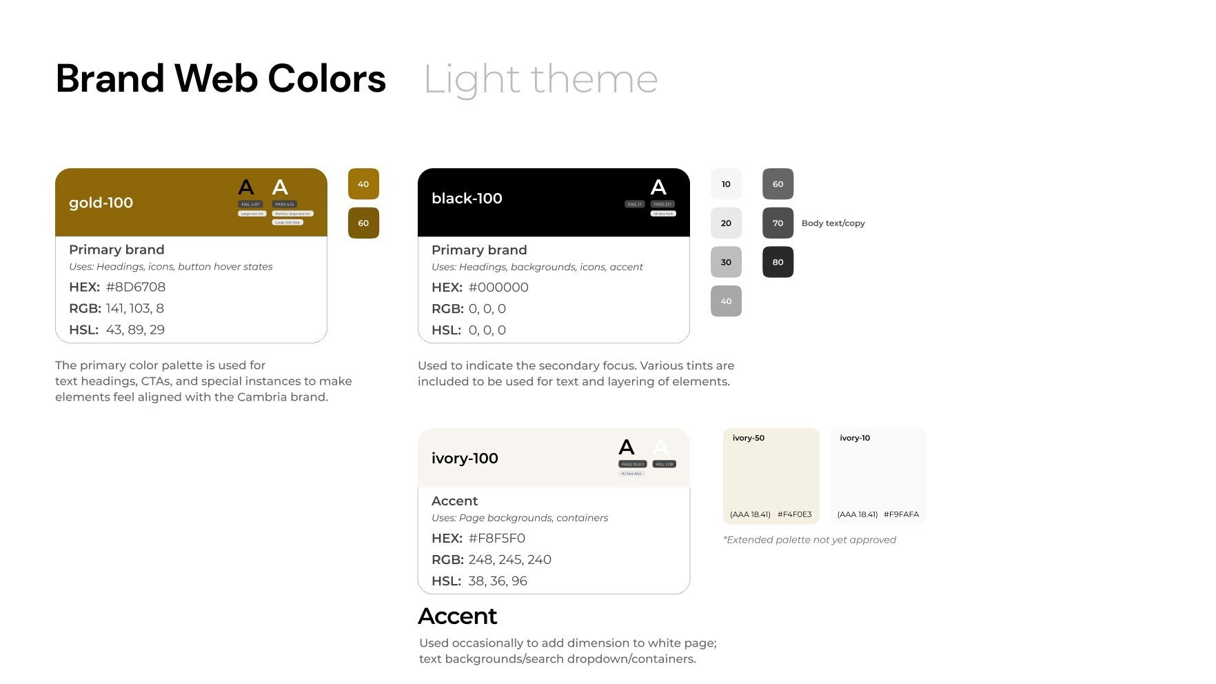
A color palette chart showing light brand web colors, including gold, black, ivory, and various shades with HEX, RGB, and HSL color codes, used for web design elements like headings and backgrounds.
A section of a color guide with support and semantic color categories, including blue, orange, red, green, and magenta, showing their hex codes, RGB values, and usage descriptions for warning, error, success, and placeholder states.
A detailed style guide for light, medium, and small mobile and desktop displays, including headers, paragraph cases, and font specifications.